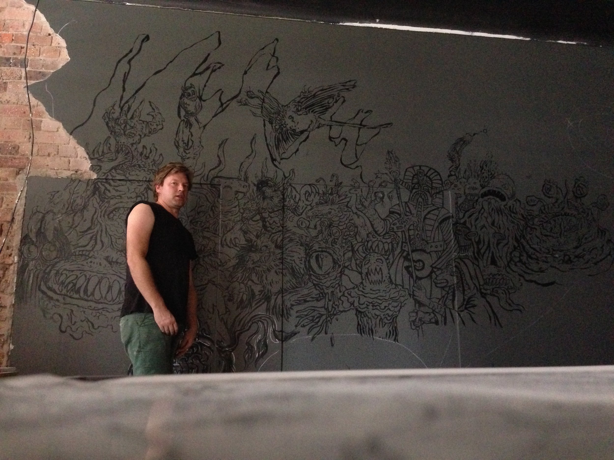
Welcome to part two! For those that missed the first instalment just see below for the initial stages of setting up this big mama.
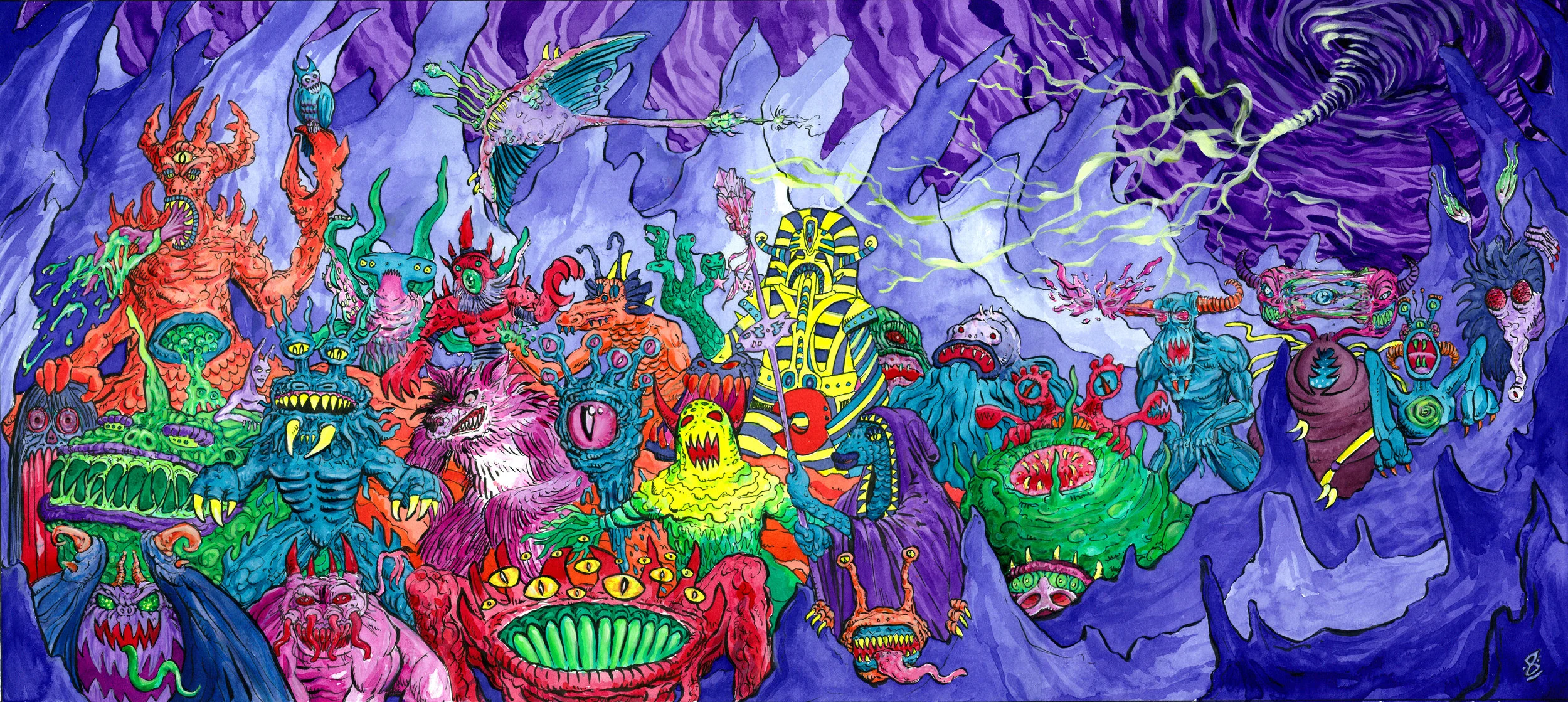
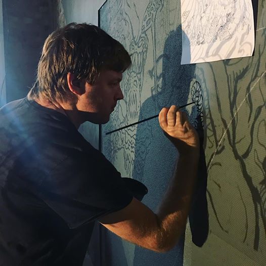
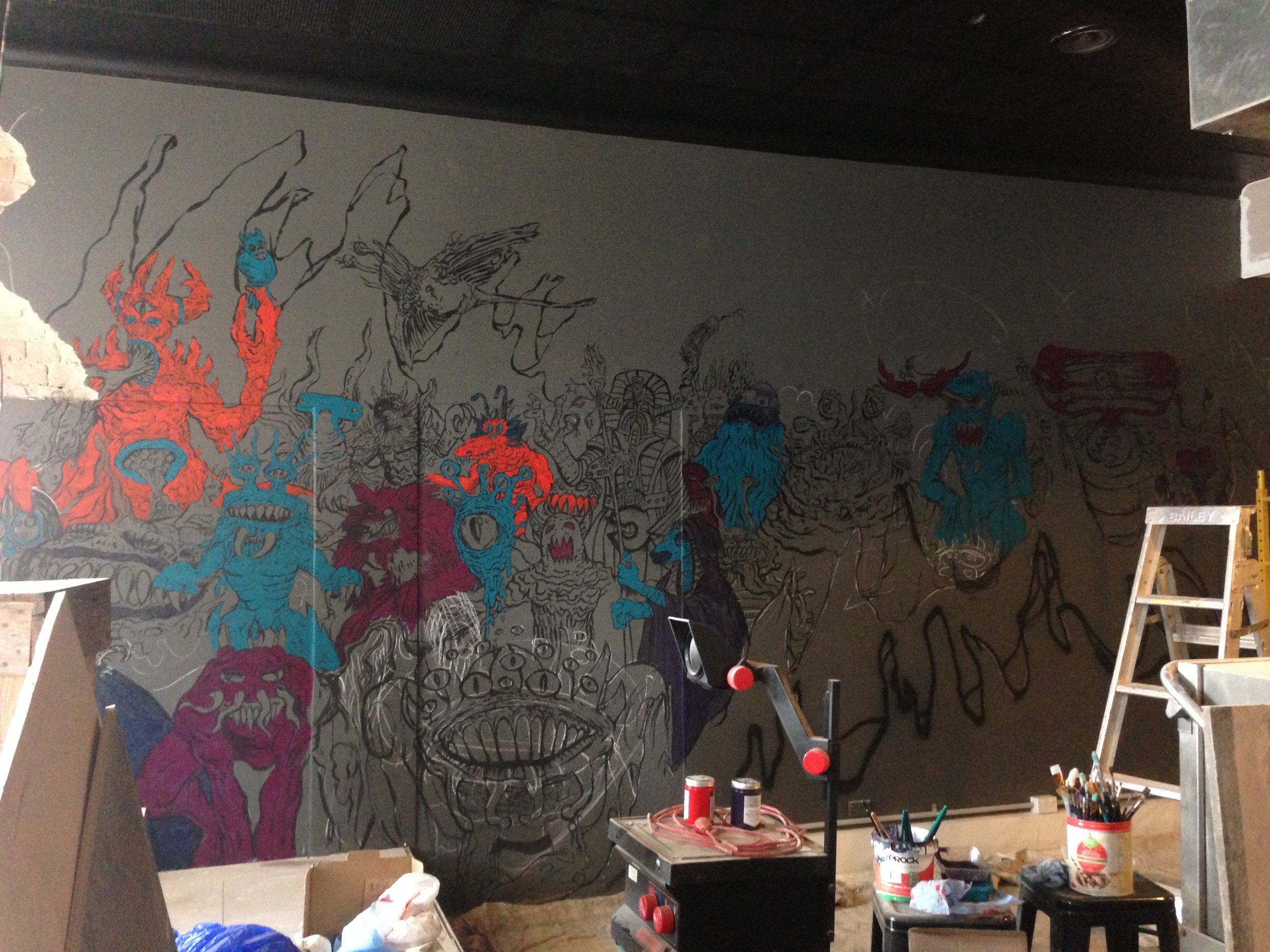
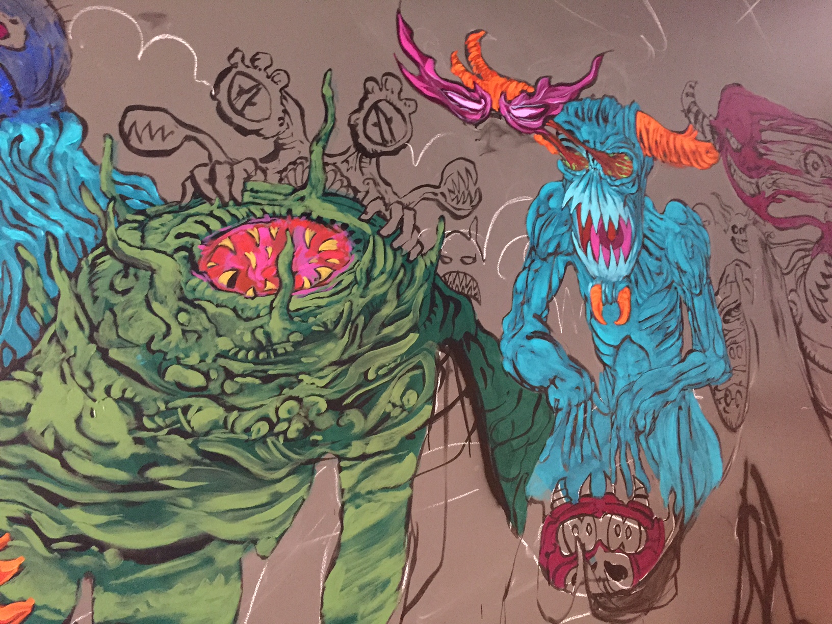
Ok so now I came to actually painting the damn thing! Although I was definitely harnessing and utilising some known tried-and-true classic 80s fantasy and computer game type aesthetics, I really wanted to push the painted aspect to give it more of a fleshed out feel and push it a bit further than your average old-school flat colour image. This involved a three tone dark to light painting style, which for a long portion of doing the mural I cursed myself for choosing, but in the end just knew in the pit of my stomach would look a thousand times better...hopefully...
But my first issue to overcome was the materials themselves. Looking back over my sketchbook notes, I stupidly forgot my tape measure the day of the wall viewing and wrote 4.5 x 3.5 m for the overall size as an approximation. How the hell I came up with this is forever a mystery that I'll never understand. In reality it was more like 9 x 4 m and so I had to do some rethinking in order to keep costs as low as possible when it came down to the first day of painting. Normally with smaller paintings I would fill in the sky and the background areas first and then place the characters on top in order to keep the colour continuity as consistent as possible and not get caught in the evil game of repainting details due to background applications creeping over the linework. This always leaves the background and foreground elements looking a bit messy and weird. But, alas, In this case I couldn't swing it and knew I'd have to battle exactly what I usually try to avoid and just described. It just would've been too much paint wasted and include a lot of applications to get the vibrancy of the colours to kick out with the characters.
