Welcome to part two! For those that missed the first instalment just see below for the initial stages of setting up this big mama.
Ok so now I came to actually painting the damn thing! Although I was definitely harnessing and utilising some known tried-and-true classic 80s fantasy and computer game type aesthetics, I really wanted to push the painted aspect to give it more of a fleshed out feel and push it a bit further than your average old-school flat colour image. This involved a three tone dark to light painting style, which for a long portion of doing the mural I cursed myself for choosing, but in the end just knew in the pit of my stomach would look a thousand times better...hopefully...
But my first issue to overcome was the materials themselves. Looking back over my sketchbook notes, I stupidly forgot my tape measure the day of the wall viewing and wrote 4.5 x 3.5 m for the overall size as an approximation. How the hell I came up with this is forever a mystery that I'll never understand. In reality it was more like 9 x 4 m and so I had to do some rethinking in order to keep costs as low as possible when it came down to the first day of painting. Normally with smaller paintings I would fill in the sky and the background areas first and then place the characters on top in order to keep the colour continuity as consistent as possible and not get caught in the evil game of repainting details due to background applications creeping over the linework. This always leaves the background and foreground elements looking a bit messy and weird. But, alas, In this case I couldn't swing it and knew I'd have to battle exactly what I usually try to avoid and just described. It just would've been too much paint wasted and include a lot of applications to get the vibrancy of the colours to kick out with the characters.

Enter plan B: Map out the entire drawing in black with an overhead projector (so I could move it around in order to reformat the image to suit the perks of the space) and literally piece it together like a patchwork. This was a more time consuming method, but it saved a certain level of double handling in paint application later on, messiness and, most importantly, material costs. Above and below were scene picks at the beginning of the process. The overhead projection slides were printed out at Officeworks. They are super cheap, have great printers for non-pro type situations and can do single OHT's. Special thanks go to to evergreen Sam Eyles for his lending me the projector. I worked out the colour in pencil over a printer out version of the image which is a much better way than using markers or digital colouring due it in some small way representing the physicality of what you'll be faced with in the painting stages. It doesn't have to look pretty, but working through colour relationships really helps in the painting process as mainly you'll find out what doesn't work and what to avoid doing. Repainting in a giant image like this is quite literally the numero uno thing you want to avoid...
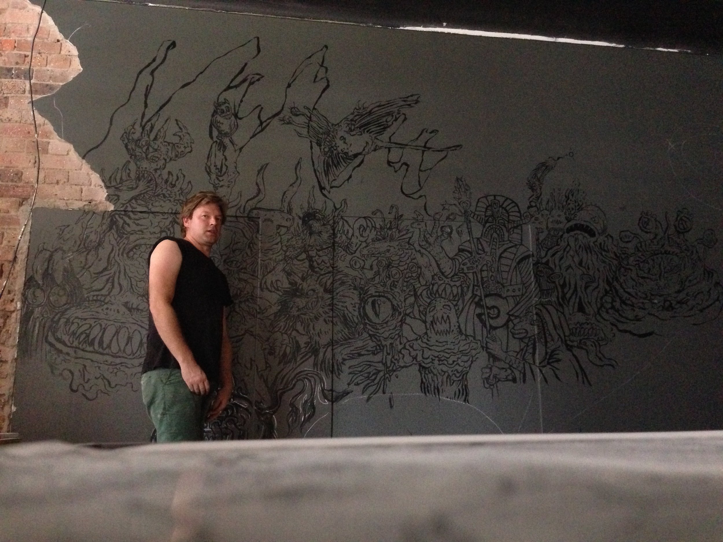
At this point I would really, really stress the point of spending a lot of time to get the underpainting linework and quality of the initial outline done in as much a resolved way as is possible. It helps to drive the vibe of the piece, directionally provides superior pointers when it comes to the colour application and gives the best impression of what is upcoming. I found I struggled with the monsters in the initial stages that were done a little slap dash...they lacked a little depth and looked a bit weaker. For the free hand monsters I used chalk to make the most of quickly organised pencil sketches to fill in the gaps due to it being easy to rub out. Most of the monsters on the far right and the bottom left were done in this way.
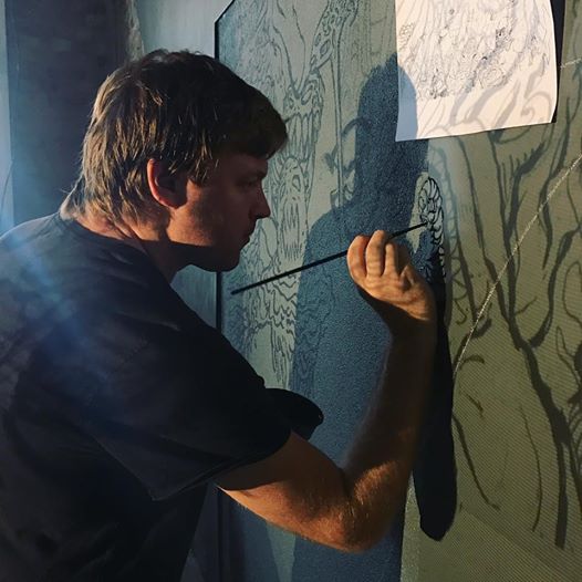
In terms of brushes I went through a few types, but by far the synthetic Liquitex acrylic brushes I used for both linework and colour applications were the best and again, cost-effective. They held up amazingly well and have great line application. I especially found the dagger brush to be useful for being able to paint thicker values and more detailed linework without having to swap brushes often. I went through three for the whole drawing, which I deemed as pretty good really. They can be a bit tricky to use and require mostly wrist work (insert joke here) and turning of the brush head rather than a standard pull/push type of application. That's why in this shot I look like a berkish dart thrower as an old mate of mine pointed out...
So with the black linework done it was time to get onto colour. For pretty much the entirety of this I used Holcroft "Professional" acrylics which were from the Impasto Colour range. I usually absolutely abhor Holcroft stuff, especially their brushes and oils - but at a pinch shortly before this project I bought a tub to fill in for a large acrylic canvas painting and its coverage and brightness were extremely surprising. Don't be a label whore or a dumb wanker art tech head. Money usually equals quality and superiority but not always and especially you need to knead out the pros and cons of what is appropriate if you're working on a tight budget. If Frank Frazetta (one greatest of the greatest painting technicians in fantasy art) preferred cheap 'n' nasty Disney kids oil paints due to his belief they were the best vibrance and texture wise then anything is possible. Safe to say across the board the Holcroft paints performed amazingly except for the deep blues and the purples, which annoyingly were the background colours which mean three applications of each and added at least a week to the project. They alone were a bit watery and did not hold well to the wall, most likely due to the fact they didn't have white in them to thicken them up. A good bit of advice post job from The Andy Harwood is to paint white or a lighter colour register down first in order to get them to ping better. I unwittingly did this later on with the rock formations around the monsters to good effect...eventually...after much frustration and cursing.
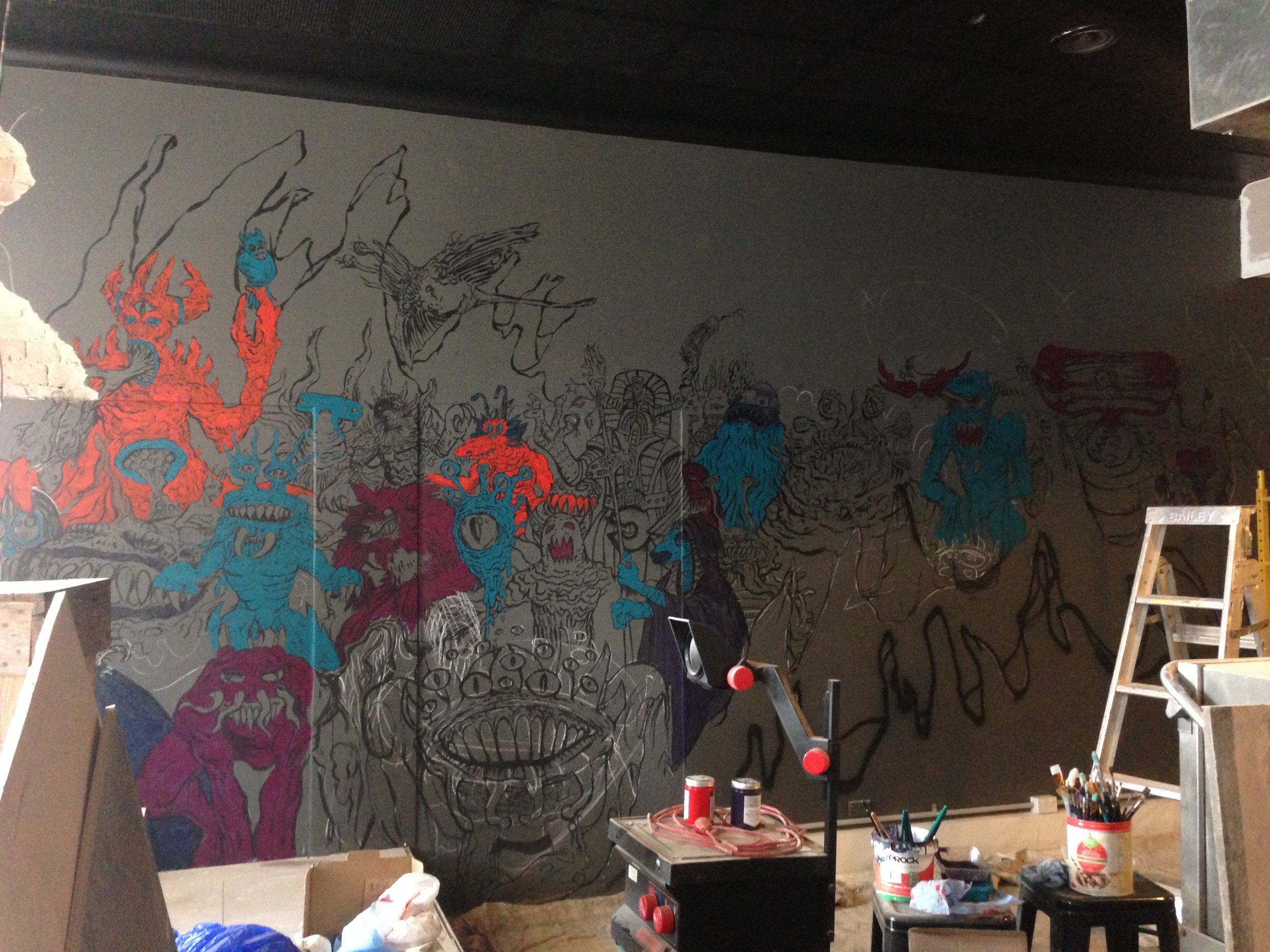
Above is an image of the patchwork beginning. I mentioned a three-tone tactic for breathing life into the monsters and this involved laying down the darkest tone of each of the colours to give the characters and forms mass. Most of it was going to be painted over, but I paid special attention to the application at this point as much of the muscle and flow of the image comes from this section of the painting. I tend to always follow mass when applying brush strokes as that helps build the forms, even when ultimately the area might be entirely painted over later on. I'm not sure why, but again bowing to impatience at this point always renders the end result not as lively. At this point I was bouncing between each of the areas with the same colour and not concentrating on each individual monster in order to speed up the process. Doing so also helped to make adjustments to the colour choices and give a better balance across the whole image in terms of what monsters were what colour. I have a "if you're not sure don't do anything until you are" method of decision making when it comes to applying colour, so sometimes I'd alter the colour in my hand and move to a different part of the painting simply to help realise the whole picture when I'd hit a "decision wall". I love a good mull. It's my excuse for being lazy.
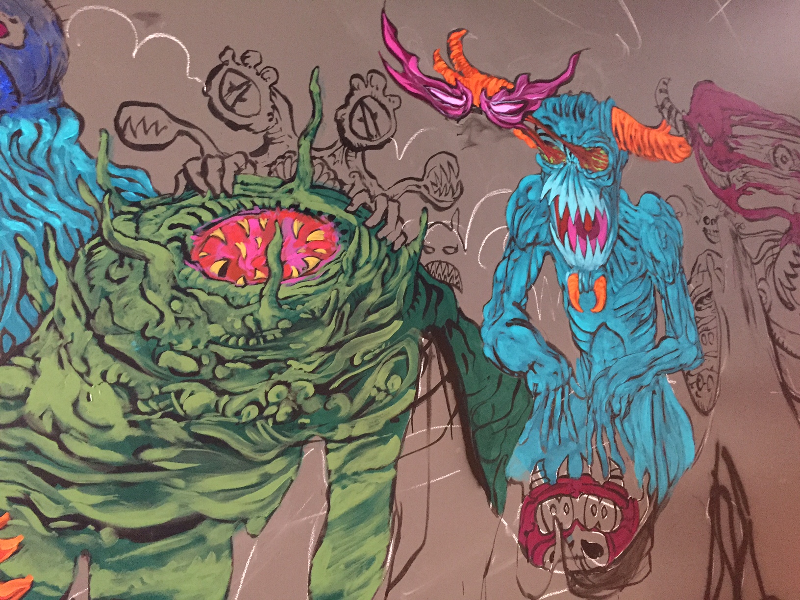
Above is a good example of the colour build I utilised for the piece. I was actually quite surprised with even how the second colour application really made the monster's forms pop. It's a good time to decide if the paint you're using is any good. If you focus on the green monster (above) you'll see the right section has no two-tone grading at all. Before the second application is made - that is the bit where everyone looking on (and certainly the artist themselves a lot of the time) has "what the fuck is going on here" expression going on. But as soon as the second application came down I knew the believability and dynamism of the monsters was going to end up great and it granted me a little bit of heart to see it take shape so quickly. The blue monster on the right (above) has everything two-tone painted at this point too, except for the eyes which were already three-toned as I wanted to see how the pink values operated for later on. Here you can see the deeper magenta colour (which is painted over the entire areas of the eyes) is bulked up with a pink and then the light purple highlights to achieve the full effect. Little by little I filled in the whole image across the board as shown below...

That's it for part two! See you next time for the resolution of the piece, my battle with sawdust and the fricken FRICKEN sky....