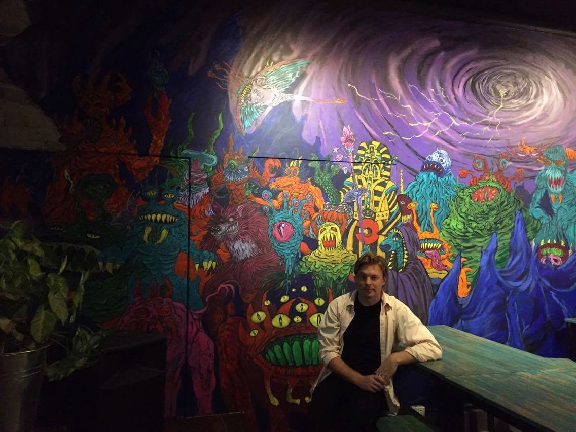
Howdy all and happy new year and all that. Hope you've gotten out alive etc..? Speaking of people that nearly didn't - the guys from Netherworld Arcade almost broke their condemned souls to have the bar ready for the new year and it was an honour to help decorate their walls.
Here's the story of the main monster wall I worked on...
So when the guys asked me to produce two images for two of their walls, I was stoked for the project but usually loathe doing murals, especially for venues as it usually ends up with the artist paying over the hill in material blowouts and a micro-managerial bar owner standing over your shoulder watching you work with a "that's my wall don't fuck it up" expression saying stuff like "I'm not artistic and you're the pro...but...isn't that brown a bit dull?". It's infuriating especially as someone who builds their colours when they paint and works in - well let's say strange order. The initial stages of the process need to be explained clearly beforehand to whoever you're working with (which can be tricky) that way there are less of those types of showdowns. That said, the Netherworld guys were amazing with their trust and support.
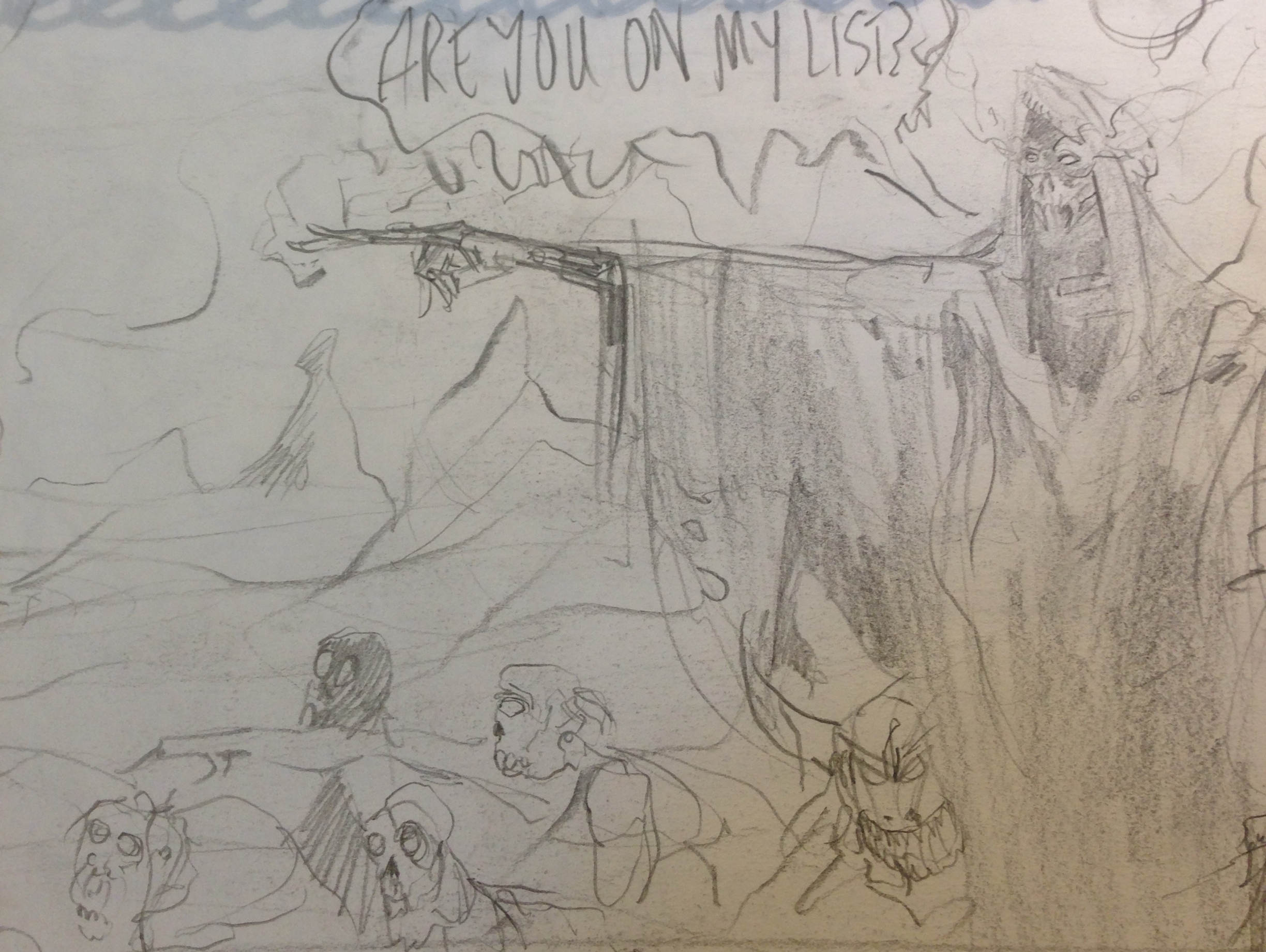
Like pretty much everything the project begun with sketches. It's always a difficult choice as to how much you need to resolve your sketches and ideas before they are handed over, as you can either a. Not get across what you are going to do properly b. Waste waaay too much time on images when you could already be onto the painting process or even worse c. Make your client worried you aren't up to the job by the sloppiness/confusing nature of the sketches. There is no right answer here and in this case I knew the guys would be very receptive to conversation about the sketches rather than be vague. That's exactly what occurred and the in the end the concept for the sketches and piece was approved, but not the image particulars.
The idea was to have an undead overlordy type dude (as above) with a horde of undead creatures kind of spilling out in an 80's horror vibe painting. I don't think I really conveyed the image properly and they deemed it a bit too dark and gritty for the venue overall. I actually think this would've worked pretty well, but always remember that you are working for a client, not the other way around when it comes to these things. This is not YOUR thing. So I decided to up the goof level and look at a bunch of vintage AD&D images and old-school fantasy paintings. I reconfigured the image but essentially kept the layout and "bunch of demons" idea, minus the overlord. They were keen on this and then it was onto sketching out characters for the mural (see below).

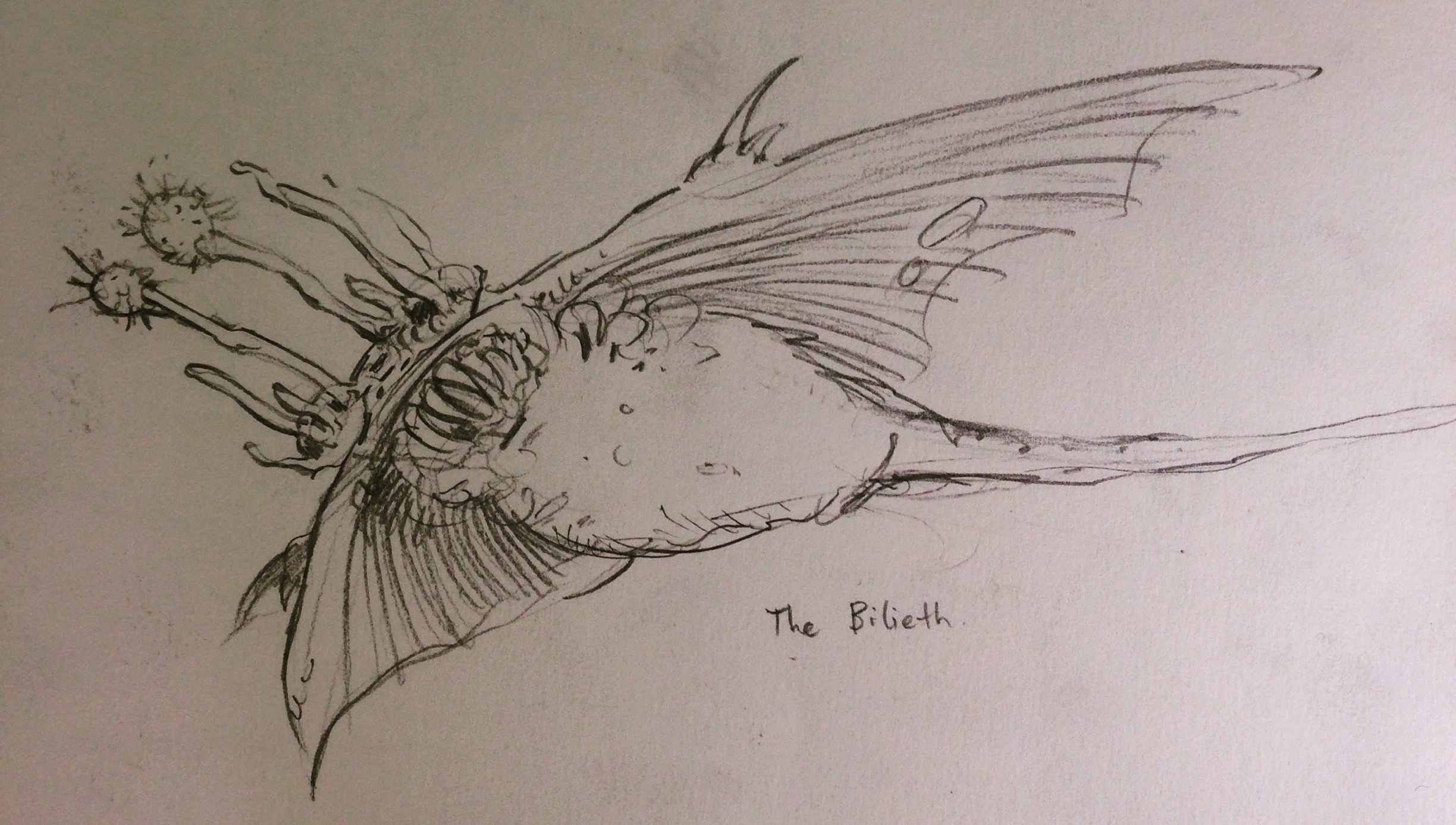
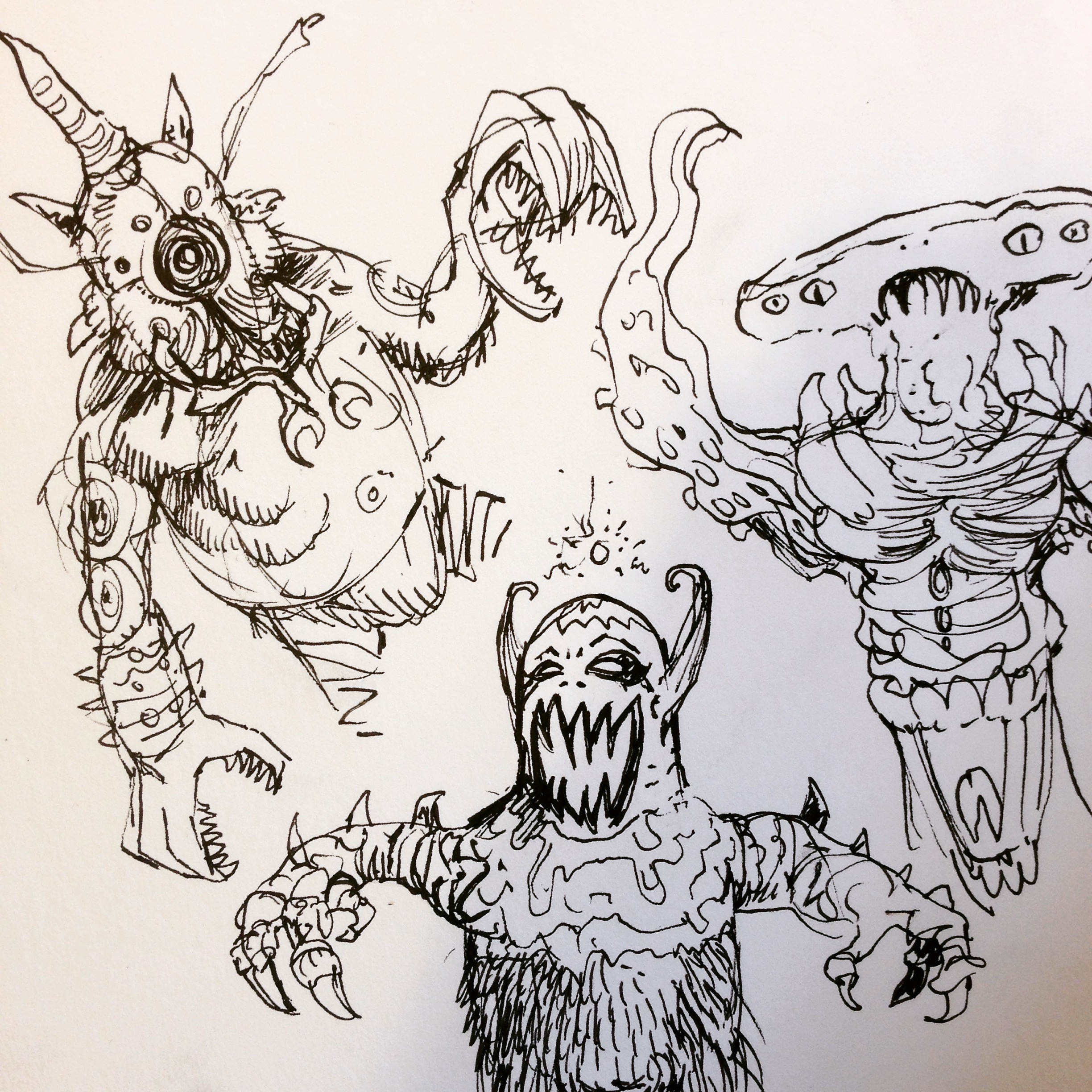
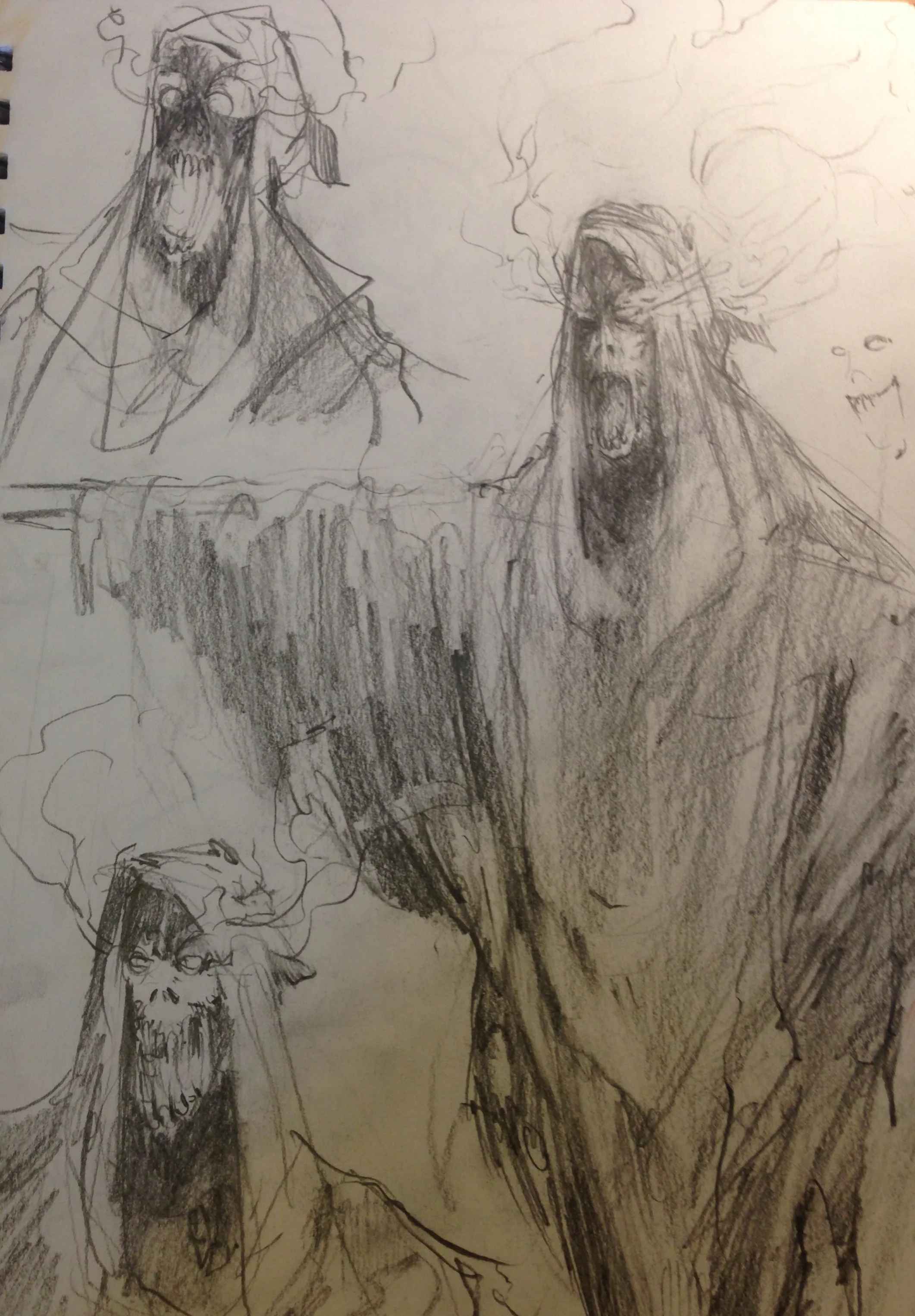
So you might have noticed I've drawn up these guys almost like concept design pieces for characters. Some I even named. Why bother? Well, I just think that anything to do with the fantasy or sci-fi world really, really benefits from having some type of narrative or story, even if it's just small things or trying to work out their actual mechanics rather than just drawing a random pastiche of nobodies. This is one of the key elements I'll always tell younger or less experienced illustrators: create a story, even if the viewer will never know it. It makes a difference. Somehow. It takes a little bit longer in the beginning, but I find that it actually helps level up and quicken the resolution of the image.
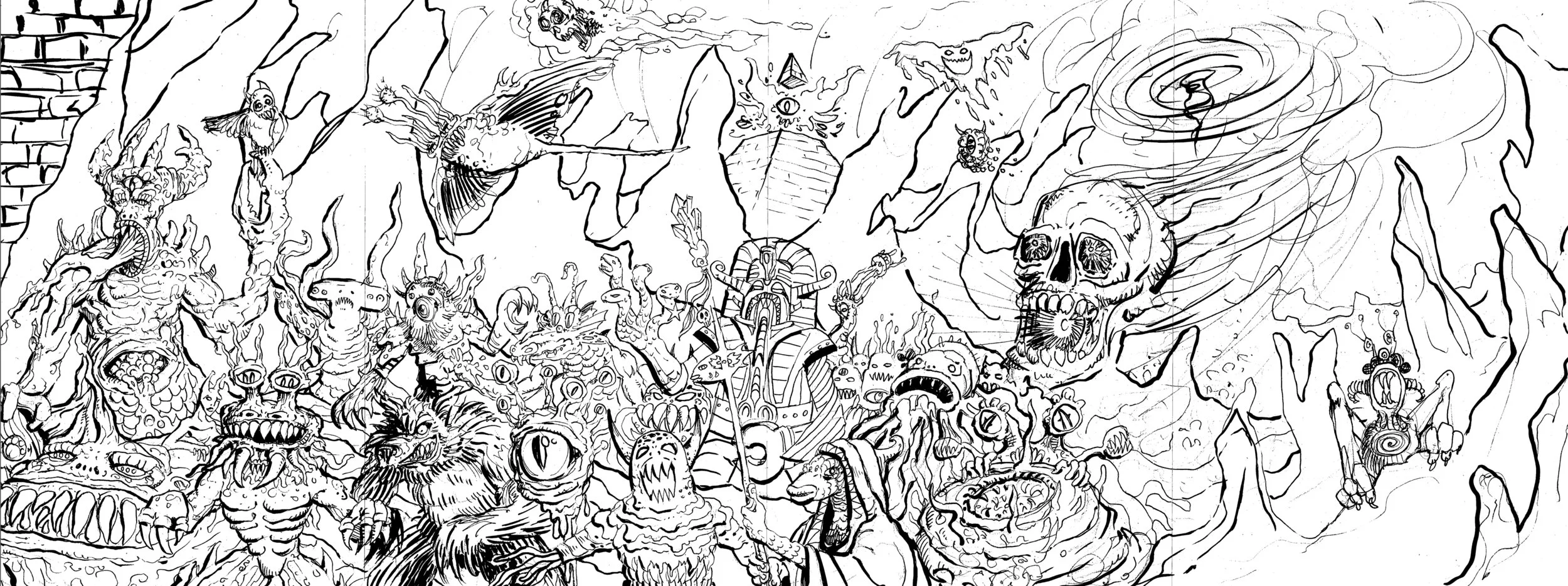
Next was to jam the monsters together with a whole image in mind. I wanted a swirling vortex for the final sky and a simple yet interesting background, but impressions of both of were only inferred at this point (see above).
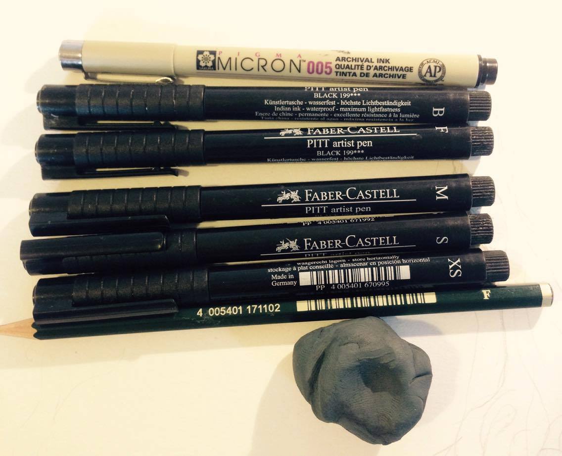
**START NERD BIT** I use primarily Faber-Castell and - for more minute work - Micron tech pens when inking in sketches or doing less stylistically poignant line-work that doesn't quite get me to crack out the Hunt 102 dip pens. The majority of serious illustrators go for the high 'n' mighty (and more expensive) brands for markers but I actually find Faber-Castell to be superior for a few reasons. Why are they my favourite go to weapons? Well their nibs are tough as shit and consistent, so they don't fall over (I'm looking at you Copic), they are filled with genuine indian ink which is usually better than pigment ink as it dries closer to how it looks freshly drawn and rubs out much better without losing as much of it's weight than alot of other brands I tried. They also possess a great tapered nib of which I can utilise the side edges of to create quite diverse line types, which is strange for a tech pen. The combination of those reasons makes them a rather surprising winner when it comes to markers, especially considering they are relatively cost-effective. For drafting I tend to like F pencils and the kneadable grey Faber-Castell eraser, as not only is it way less stressful for your paper's grain when you are rubbing out, but it's great to just stick it on your desk and hold up/stop objects falling off your table when things get crazy. It took me a while to come to grey erasers, but when you ink with Hunt 102s, they are almost a must. As the paper will tear away much more easily with vinyl rubbers. **END NERD BIT**
Little by little I placed the beasties around in a way that was hopefully not too repetitive and had a good balance of variety in each of the area. Even with something like this, I think keeping classic elements of balance is important. Rule of Thirds etc. I think it's really important also to have a good clear image of the particulars to work with otherwise you'll run into problems which I'll talk about in the next post. Above is the final image I sent the guys and they were pretty pleased! First stage done!